Extras – Logo Designs – Exclusive pictures

The Super Soccer logo is a vibrant testament to creativity, combining the dynamic energy of green and the excitement of orange. The ingenious design captures the essence of soccer with a playful yet sophisticated flair. The use of colors not only adds visual appeal but also conveys the passion and enthusiasm associated with the sport. This logo is a striking visual identity for Super Soccer, promising to stand out and leave a lasting impression in the world of sports branding.
The logos crafted for Ros&Feijão demonstrate a perfect blend of creativity and thoughtful design. The dual versions showcase versatility and adaptability.
The incorporation of Rose’s name into the playfully reimagined “Arroz e Feijão” adds a personalized touch, cleverly mirroring the essence of rice and beans.
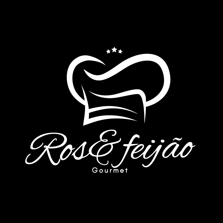
The simplicity of the design is elegant, making it easily recognizable and suitable for various applications. These logos are a tasteful representation of Ros&Feijão, promising a visual identity that resonates with the heart and soul of the Brazilian restaurant’s cuisine.
Sophisticated Version:
The second logo for Ros&Feijão exudes sophistication and refinement. The intricate design reflects a nuanced understanding of the restaurant’s identity. The incorporation of elements retains a sense of playfulness while elevating the brand’s visual appeal. This logo speaks to a more upscale aesthetic, making it a fitting choice for occasions where a touch of elegance is desired.
Takeaway Chicken Restaurant Version:
The third logo, tailored for the take-away chicken restaurant under the Ros&Feijão umbrella, is a stroke of design brilliance. The focus on simplicity and specificity caters perfectly to the quick-service nature of a takeaway establishment. The incorporation of elements related to chicken subtly communicates the restaurant’s specialization, making it instantly recognizable and memorable.
Together, these logos form a cohesive visual identity for Ros&Feijão, catering to different facets of the restaurant’s offerings with a harmonious blend of creativity and purposeful design.

The logo crafted for Vinisa & Painting company embodies strength, reliability, and professionalism. With a thoughtful combination of construction-related elements, it communicates the company’s commitment to quality craftsmanship. The simplicity and versatility of the design ensure easy recognition and memorability.
Overall, this logo is a successful representation of Vinisa & Painting company’s brand identity, poised to make a lasting impact in the construction industry.
Exclusive Pictures
